The Divergence
Top-quartile minus bottom-quartile spending growth sits at -11.1 points
What is the current The Divergence?
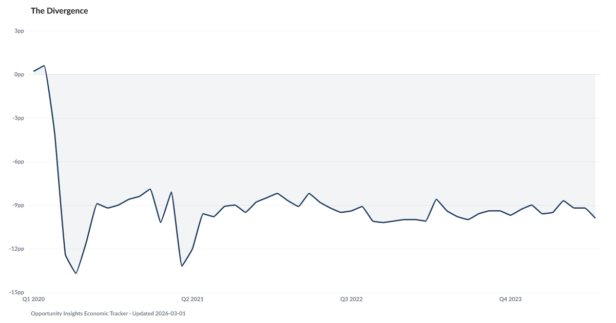
The spending gap between top-quartile and bottom-quartile households stood at -11.1 points in April 2026, measuring how consumer spending diverges across income levels. A widening gap indicates that lower-income households are cutting back on spending while higher-income households continue spending — a K-shaped pattern that standard consumer spending averages obscure. Source: Opportunity Insights / Bank of America Institute.
Top-quartile minus bottom-quartile spending growth sits at -11.1 points as of April 2026 — the same range the spread has held since the 2020-21 stimulus shock closed.
The economy has spent the last two years being described as resilient. The word works if the measurement is national averages. It stops working when the data is split by income.
Opportunity Insights tracks consumer card spending by income quartile, indexed to January 2020. In early 2020, the spread between top- and bottom-quartile cumulative spending growth sat within a point of zero. The 2020-21 stimulus shock briefly opened a wider gap as transfers reached lower-income households. After stimulus wound down the gap reopened and has sat around the -8 to -15 point range since 2022. The April 2026 print of -11.1 points is inside that persistent post-stimulus range. That is a two-track economy operating under one headline number.
This is what people mean when they say the aggregate data feels wrong. High-income spending keeps accelerating across restaurants, travel, and discretionary services. Low-income spending is flat or contracting. Both show up in the same national retail print. The average tells you almost nothing about either group.
The Squeeze helps explain the mechanism: 24 percent of households now spend 95 percent or more of their income on necessities. Those households can't cut back further without cutting into rent or groceries. The K-Shape shows the wage side of the same split. When the two income halves are moving this far apart, the composite story is the only story that conceals it.
Explore Further
How has The Divergence changed over time?

Most affected counties
Counties with the highest debt burden scores in the County Distress Index.
Explore all 3,144 counties →| Period | Value | YoY Change |
|---|---|---|
| Apr 2026 | -11.1 pts | +0.0 pts |
| Mar 2026 | -9.6 pts | +0.0 pts |
| Feb 2026 | -10.2 pts | −1.6 pts |
| Jan 2026 | -12.6 pts | −0.5 pts |
| Dec 2025 | -15.1 pts | −1.2 pts |
| Nov 2025 | -9.2 pts | +0.7 pts |
| Oct 2025 | -9.2 pts | −0.9 pts |
| Sep 2025 | -9.7 pts | −2.1 pts |
| Aug 2025 | -9.7 pts | −0.7 pts |
| Jul 2025 | -11 pts | −1.6 pts |
| Jun 2025 | -10.4 pts | −0.7 pts |
| May 2025 | -10.1 pts | −1.5 pts |
Frequently Asked Questions
What does the spending divergence measure?
It compares consumer spending growth between top-quartile and bottom-quartile households. A widening gap shows that aggregate spending data masks a K-shaped reality where lower-income households are pulling back while upper-income households maintain or increase spending.
Why does spending divergence matter?
Aggregate consumer spending is approximately 70% of U.S. GDP. If spending growth is driven entirely by the top quartile while the bottom quartile contracts, the economy can appear healthy on average while a large share of households experiences worsening conditions.
Where does spending divergence data come from?
Opportunity Insights and Bank of America Institute both track spending by income quartile using different methodologies — credit card transaction data and internal depositor data respectively. The convergence of both sources strengthens the signal.

Quick poll
Is this affecting you or your household?
Discussion
Get the numbers when they move.
New data drops, indicator updates, and ADI score changes — delivered when it matters. No spam.
or Create an Account for full access
Loading comments…