The Pipeline
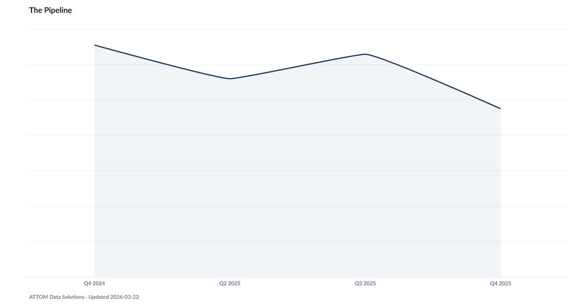
Down from 6.55 a year ago; the foreclosure pipeline is draining
What is the current The Pipeline?
Foreclosure starts versus completions tracks the flow of properties entering the foreclosure process relative to those exiting it through completed sales or bank repossession. When starts exceed completions, the pipeline of distressed properties is growing — a forward-looking signal that more foreclosed inventory will hit the housing market in coming quarters. Source: ATTOM Data Solutions.
For every home that completes foreclosure, 4.8 new cases enter the pipeline — down sharply from a year earlier, but still well above equilibrium.
A foreclosure completion is an endpoint. A foreclosure start is not.
Most homeowners who enter the pipeline never reach the courthouse steps. They cure the default, sell ahead of the auction, or negotiate a short sale with the servicer. What the starts-to-completions ratio tells us is how many new cases are entering the queue relative to how many are exiting it — a measure of whether the inventory of distressed borrowers is building or draining.
At 4.8 in Q4 2025, the ratio is elevated but improving. ATTOM recorded above 6 starts per completion as recently as the end of 2024. The queue is still growing, but more slowly. In a healthy housing market the ratio runs closer to 2.
The pipeline's shape explains why other housing metrics look deceptively quiet. Mortgage Charge-Offs sit at zero. Mortgage Delinquency has been flat for many quarters. Neither of those tells you anything about the cases currently in the queue — only about the ones that finished months ago. The Pipeline is the leading view into what is building upstream.
Explore Further
Is this happening to you?
Do you know someone who has lost their home to foreclosure?
How has The Pipeline changed over time?

Most affected counties
Counties with the highest default and legal scores in the County Distress Index.
Explore all 3,144 counties →| Period | Value | YoY Change |
|---|---|---|
| Q4 2025 | 4.75 | −1.80 |
| Q3 2025 | 6.29 | — |
| Q2 2025 | 5.6 | — |
| Q4 2024 | 6.55 | — |
Frequently Asked Questions
What does foreclosure starts vs. completions measure?
It compares the number of properties entering the foreclosure process (starts) with those exiting it (completions — either sold at auction or repossessed by the bank). When starts exceed completions, the pipeline of distressed properties is growing.
Why does the pipeline ratio matter?
A growing foreclosure pipeline means more distressed properties will hit the market in 12–18 months, potentially putting downward pressure on home prices in affected neighborhoods. It is a leading indicator of future housing inventory and price effects.
Where does foreclosure starts and completions data come from?
ATTOM Data Solutions tracks foreclosure activity from county recorder offices nationwide, broken down by default notices (starts), scheduled auctions, and bank repossessions (completions). Data is published quarterly.

Quick poll
Is this affecting you or your household?
Discussion
Get the numbers when they move.
New data drops, indicator updates, and ADI score changes — delivered when it matters. No spam.
or Create an Account for full access
Loading comments…